A LOGO WITH HEART
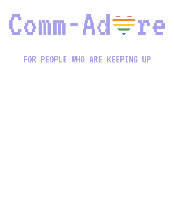
Comm-Adore needed a face, so we spent a day on one.
The heart
The name says what we feel about these machines, so the O in Adore became a heart. Its stripes are the ones from the Commodore rainbow badge we all remember: red, orange, yellow, green and blue, with gaps between them.
Getting the gaps right took a few rounds. Too thin and the stripes run together at small sizes; too wide and it stops looking like a heart. We settled on two: a little tighter when the heart stands alone, a little more open when it sits inside the word.
The letters
The letters are in a font cut to look like a monitor's text, in the 64's light blue, the colour of the screen's text after you switch it on. No outlines, no gradients. It should look like it came out of the machine.
The tagline
Under the logo: FOR PEOPLE WHO ARE KEEPING UP. On the home screen it reads FOR PEOPLE WHO ADORE THEIR 64. Both are true.
If you've typed iadoremy64.com into a browser, you ended up here too. That one was too good not to have.
You'll see the heart on the title screen of everything we make from now on, starting with Hazelwood.